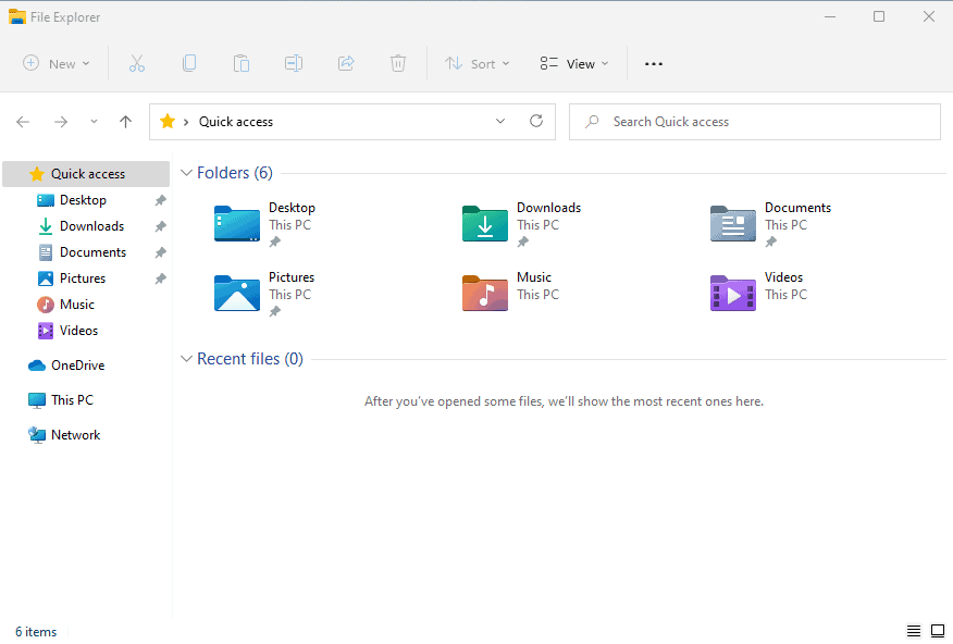
File Explorer, the default file management tool of Windows 11, is not the same tool that users of Windows 10 use to manage files. Microsoft redesigned large parts of File Explorer, and all of the changes can be described with a single word: minimalism.
Windows 11 is still in development, and while there is not a lot of time left until the official release date October 5th, 2021, there is a chance that things may change. It seems unlikely that File Explorer will see major changes this short for release, though.
When you open File Explorer in Windows 11, you will notice several changes immediately. Gone is the ribbon toolbar with its tab and functions; Microsoft replaced it with a single toolbar that displays just a few core options.

Some options are only visible in certain locations, others all the time. The main interaction options allow users to create new files, folders and other items, cut, copy, paste, rename, share and delete items.
Additional items may be displayed, such as ejecting a disc when an optical drive is selected.
The sort menu lists available sorting options, and view options to change the layout and design of items in File Explorer, to enable compact view mode, and some other options, hidden under "show", e.g. to show file extensions all the time.
There is also a three dots menu at the top, which displays additional options, such as selection options, copy path, properties and the folder options.
How does it stack up against Windows 10's ribbon toolbar in File Explorer?

Some options have been merged, e.g. the New folder and New item menus have been merged into the New menu in Windows 11's File Explorer. Others, are nowhere to be seen. Move to and Copy to are not available anymore, and neither are pin to Quick access, grouping options, adding columns, making all columns fit the window, or the link to remove access or advanced security.
Some of these may be available elsewhere, e.g. in the properties window when it is opened, or when right-clicking on column headers to add or remove columns.
The new toolbar is not the main usability issue though. Microsoft has probably analyzed data that it has on File Explorer usage and removed options that were not used a lot.
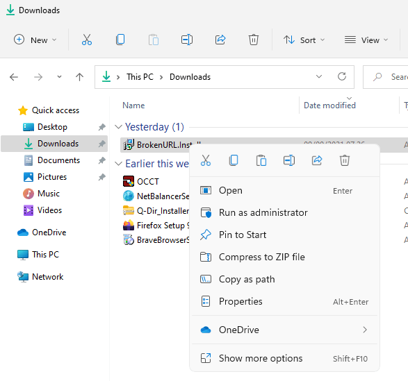
The main usability issue becomes apparent when you right-click on items. Microsoft developed a new right-click menu design and layout.

It is as streamlined as the new toolbar in File Explorer, and when you compare it to the right-click menu of Windows 10's File Explorer, you will notice that a lot of options are missing.
Some context menu options are displayed only if the right file type is selected, but core options are missing from the menu. Microsoft did not remove the classic menu entirely though, as it is spawned when you activate the "show more options" link or press Shift-F10.
The classic menu is then displayed in all its glory and with all the missing options of the new File Explorer menu.
Several things need to be noted. First, if you install third-party applications that add their own items to the context menu, then you will notice that these are not displayed in the new menu. Maybe it is required to adjust the installer to make that happen, but at least in the preview builds, all third-party context menus are displayed only when you open the classic menu using "show more options".
The decision is terrible for usability. Want to zip files quickly using a program such as 7-Zip, WinRar or PeaZip? Then you need to right-click the selection, select show more options, and then select the archive options of the program that you installed.
Some native options are also only displayed in the classic menu. Restore previous version, pin to taskbar, create shortcut, or give access to are only displayed in that menu, and not the simple one.
Closing Words
File Explorer on Windows 11 has serious usability issues. Besides the stripped down main toolbar menu that hides many of the options in sub-sub-menus, it is the dual-windowed right-click context menu that needs to be mentioned specifically.
Having to juggle between the simple new menu and the full menu that needs to be spawned from the simple menu or by using a keyboard shortcut, is impacting usability significantly.
Will File Managers, similarly to Start replacement applications on Windows 10, make a comeback on Windows 11 as a consequence?
Now You: What is your take on the new File Manager?
Thank you for being a Ghacks reader. The post Windows 11's File Explorer has serious usability issues appeared first on gHacks Technology News.

0 Commentaires