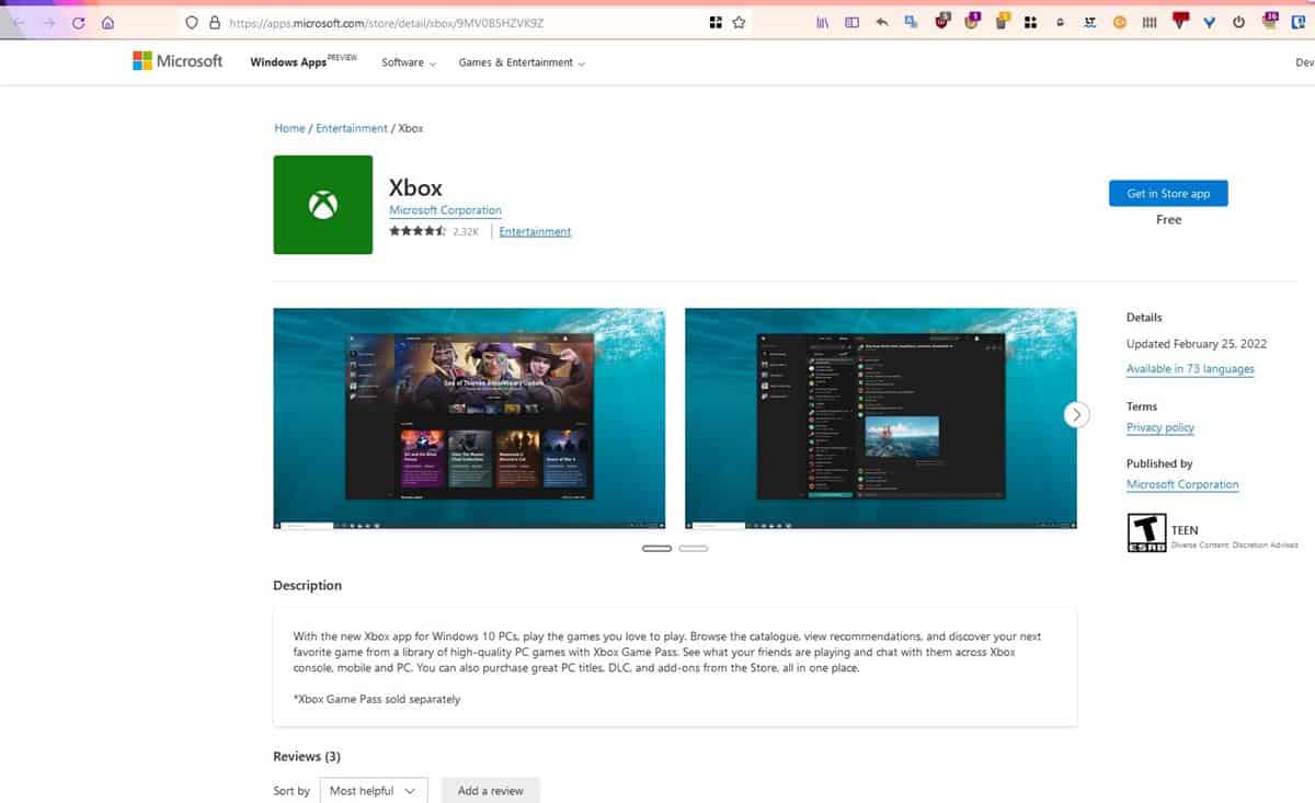
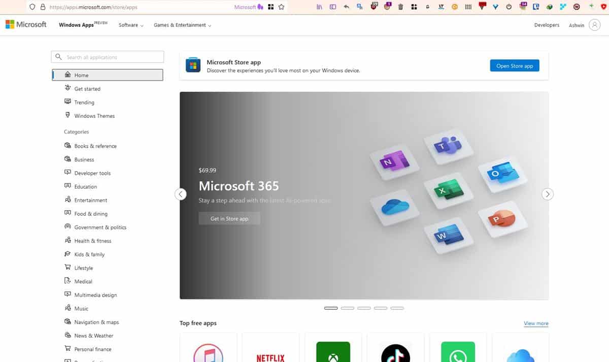
A new design for the web version of the Microsoft Store is live. It has the Preview tag at the top, which indicates it is still an experimental design.

Microsoft overhauled its Store app on PC, when Windows 11 was released last year. It was a much-needed change. I find myself using the Store app a lot more on Windows 11, than I used to on Windows 10. The new design is quite good, easier to navigate, and snappier in terms of performance compared to its predecessor. It is not perfect, there is always room for improvement.
New design for Microsoft Store on the web
The redesigned web interface of the Microsoft Store, was first spotted by FireCubeStudios. It resembles the design of the Store app on Windows 11. The sidebar on the left offers a better way to sift through the various categories of apps.
The website can be accessed from this URL. It has the same card-like interface for apps, screenshots in app listings, descriptions, etc. There is also a new section for user reviews, and you can sort the comments by recency or helpfulness.

The Microsoft Store on the web isn't particularly useful, it still redirects you to its desktop program to download the apps that you want. So it takes an extra click, but since the Store app's interface isn't particularly mouse-friendly, the web version turns out to be better. The latter makes it easier to share links to apps, since there are no restrictions that prevent us from using the browser's right-click menu (except the sidebar).
An article on Thurrot's blog points out that the web version displays the date when an app was update. In contrast, the Microsoft Store app does not give us this data. It is still missing other useful information such as release notes, version numbers, and the system requirements for apps. Another important absentee on the reworked web version, is the Store's games section, perhaps that will be added in the future.
Microsoft needs to curate its Store app
All these improvements are nice and welcome to have. But, let us not forget the elephant in the room, the content available on the Store. I'm not talking about the quality of the apps, but the existence of the numerous fake apps available on the Microsoft Store. This is not the first time we have seen devious apps on the storefront. Does Microsoft even care about this problem?
Not only do these deceptive apps violate the license, copyright of the programs that they imitate, they could be potentially dangerous, aka malware. Some of these apps appear right on the first page of the search results. This will not only confuse the average user, but a person who is unaware may end up installing a fake app instead of the original one, because they could not distinguish the difference between the two. Why? Because the name and/or icon of the apps were similar.
A few of these fake apps aren't free either, you have to pay for these illegal programs. It's embarrassing really, Microsoft needs to curate its Store responsibly, by checking each app before they are allowed to be published, in order to keep its consumer base safe.
Thank you for being a Ghacks reader. The post Microsoft Store gets a new web interface similar to the one on Windows 10 and 11 appeared first on gHacks Technology News.

0 Commentaires