Microsoft has prospered since it was founded in 1975. They've given the world new products and offerings that have changed how people manage their work and personal life. Microsoft has also changed its branding and image to match its products. This article will look at various Microsoft logos over the past 47 years.
1975-1980: Sweeping Line

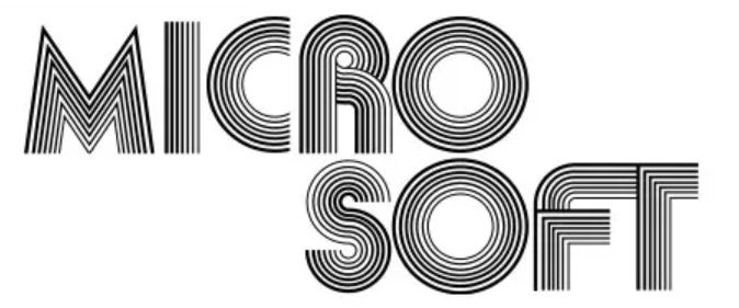
This was the beginning of an era, and Microsoft was called Micro-Soft. The first company logo was created by top artist Simon Daniels. He used the Aki lines typeface and created the logo in 1975. This typeface was created in 1970 by Akihiko Seki. It used seven curved lines to form letters.
Microsoft's first major product was the Altair Basic, created for the Altair 8800 microcomputer. This was going to lay the foundation for personal computers. Microsoft was co-founded by Paul Allen and Bill Gates in 1975 in Albuquerque, NM. They then moved based in 1979 to Bellvue, WA, as their products started serving other microcomputers.
1980-1982: Metal-Inspired

Micro-Soft changed its name to Microsoft in 1980. They were working toward their first hardware product, and this also coincided with a rebranding effort. While many may think that this logo was inspired by the famous rock band Metallica, they are wrong. Metallica took inspiration from this logo, as their logo was revealed three years after this logo came out.
Simon Daniels created this logo as well and called it "metal." He used the New Zelek typeface and modified it slightly, as seen with the extended M & R alphabets. This logo can be seen in the Microsoft ads for their SoftCard. The SoftCard added Z80 CPU to the Apple II computer that enabled it to run CP/M. The logo is also seen in the ad for RAMCard. This was used to add RAM to the Apple II.
1982-1987: Blibbet

Just two years after revealing "metal," Simon Daniels worked on a new design. This was based on the typeface ITC Avant Garde Gothic Demi Bold. The logo had a stylized O. This was said to resemble the O in a floppy disk, and people started calling this logo "the Blibbet." Some others also called it the Death Star. This was due to computerized designs featuring in the 1977 Star Ways. Microsoft used this logo in watermarks and other corporate signage.
Microsoft later revealed they had paid a hefty sum for their next logo design. This prompted Microsoft pranksters Dave Norris and Hans Spiller to come up with a memo and a pin-on button that read "Save the Blibbet." Many people fell in love with the Blibbet logo and started collecting all things Blibbet before it was replaced.
1987-2012: Pac-Man

Microsoft slowly grew into a world-renowned business force, and it introduced its new logo in February 1987. This was the first Microsoft logo that featured lowercase. It relied on Helvetica Italic Black typeface and also had a special notch in the letter O.
The slash between the letters O and S conveyed speed and motion and emphasized the soft part of the name.
However, the notch in the O reminded many people of Pac-Man's mouth. This logo saw minor redesigns over the next few years and brought a lot of success. It also saw the emergence of Xbox and various other products.
2012-2022: The Grid

After 25 years, Microsoft unveiled its next new logo. This new logo has the Segoe Semibold font, and Jason Wells designed it. This font is also used in Microsoft's interfaces. This is the first time the symbol is not part of the font.
The new logo features four colors used traditionally by Microsoft (red, blue, green, and yellow). The logo is also said to indicate the Metro design language seen in Windows 8 (released just before the logo was unveiled). Metro used rectangle panels rather than icons. Although Microsoft no longer uses Metro in Windows 11, it tweaked the logo slightly in 2021. The four colored squares were modified to become four blue squares.

What's Next?
As we've seen, Microsoft has not been shy about changing its logo to match its branding and vision. Only time will tell what the next Microsoft logo has in store. Watch this space for more.
Thank you for being a Ghacks reader. The post Every Microsoft Company Logo From 1975-2022 appeared first on gHacks Technology News.

0 Commentaires